
10-Decile Profitability Ranking
Your customers split into 10 equal groups from least to most profitable. See how concentrated your revenue really is.
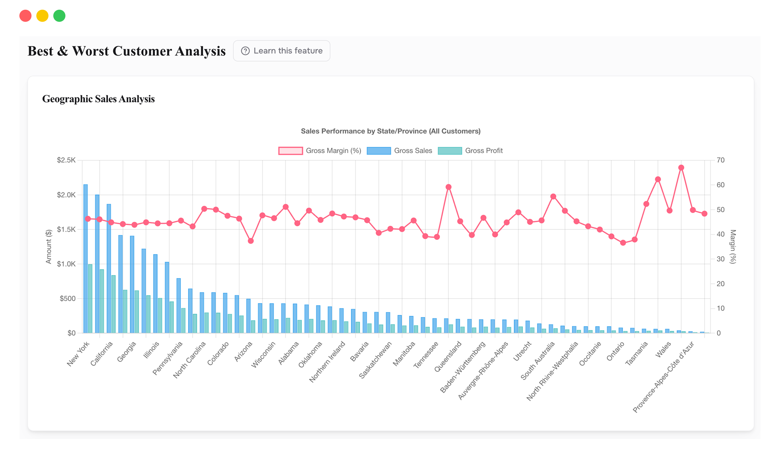
BEST & WORST CUSTOMERS
Every customer ranked by profitability and split into deciles. See how concentrated your revenue is, where your best buyers live, and which segments to double down on or walk away from.
Most retention strategies are one-size-fits-all: the same emails, the same discounts, the same loyalty program for everyone. But your top 10% of customers probably generate 30 to 40% of your profit. Your bottom 10% might be net negative after discounts, returns, and acquisition cost. Treating them identically is leaving money on the table at both ends.
Best & Worst Customers splits your entire customer base into 10 equal groups ranked by lifetime gross profit. The visualization shows exactly how much each decile contributes to total profit. You can toggle between total profit and average profit per customer to see both the aggregate impact and the per-person economics.
Below the decile breakdown, a geographic analysis shows where your best and worst customers are concentrated. You can select any segment (top 5%, bottom 10%, middle 50%) and see their distribution on a map. When you turn on the CAC toggle, profit is recalculated after acquisition cost, so a customer with $100 gross profit and $80 CAC shows as $20, not $100.
Your customers split into 10 equal groups from least to most profitable. See how concentrated your revenue really is.
View aggregate impact per decile or per-customer averages. Both tell different stories.
See where your best customers live on a map. Concentrate spend where profitable customers already cluster.
Factor in acquisition cost to see true post-acquisition profit. A customer who looks profitable might barely break even.
Analyze any time window. Compare this quarter's customer quality against last year's.
Hide zero-dollar orders, discounted orders, or refunded orders to isolate your clean, full-price customer base.
Look at the Lifetime Gross Profit Contribution chart and notice where the profit is concentrated. In most stores, the top 10% of customers (decile 10) account for 30 to 40% of all profit. The bottom 10% (decile 1) are often unprofitable. The implication is that your retention strategy shouldn't be "keep everyone." It should be "obsess over the top 20% and fix or exit the bottom 20%."
You know exactly who they are, how many there are, and how much they're worth. Even a small improvement in their retention rate is worth more than acquiring dozens of average customers.
Are the bottom 10% clustered in one region? Did they buy on discount? Were they refund-heavy? The filters let you test each theory before deciding whether to fix the segment or stop acquiring them.
The geographic section shows where your most profitable customers live. Your next profitable customer is most likely nearby. Spend there.
Turn on the CAC toggle. A customer with $100 gross profit and $80 CAC is only $20 in the black. Sort by that number and you'll see which customers are worth fighting for.
Usually heavy discounts, returns, or refunds. Use the filters to isolate these and understand whether it's a pricing problem, an acquisition problem, or both.
Yes, if you have Facebook or Google Ads connected. Without it, you're seeing margin before acquisition cost, which is only half the story.
Shopify ranks customers by revenue. This ranks them by profit after every cost, including acquisition cost. A high-revenue customer who only buys during 30%-off sales and returns half their orders won't rank well here, and shouldn't.
Connect your Shopify store in 2 minutes. Your P&L, LTV, unit economics, and forecasts are ready the same day. No credit card required to start.