
Month-over-Month Sales
This month's revenue plotted day-by-day against last month. See exactly where you stand before the month closes.
DASHBOARD
Month-over-month sales, customer lifetime value, acquisition channels, and repeat rate. Not stitched together from five tabs. Built into one view that updates itself.
By the time you've pulled the numbers together, the week is half over and you still aren't sure if things are better or worse than last month. The data exists. It's just scattered across tools that were never designed to talk to each other.
The Dashboard is your daily command center. It opens with a month-over-month sales comparison that plots this month's daily revenue against the previous month, so you can see where you stand without waiting for the month to close. Below that, your top acquisition channels are ranked by how many new customers each one brought in, not by clicks or impressions.
Alongside sales, you see customer lifetime value broken down by segment, repeat rate trends that show whether your retention is actually improving, and organic and AI-driven search traffic if you've connected Google Analytics. Every metric card is draggable, so you can arrange the view around whatever matters most to your business right now.
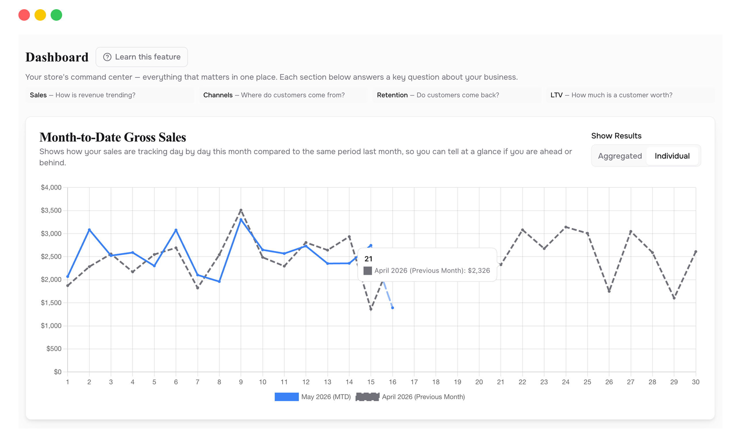
This month's revenue plotted day-by-day against last month. See exactly where you stand before the month closes.
Which acquisition sources are actually bringing in first-time buyers, ranked by volume.
Customer lifetime value across segments, so you know what a new customer is actually worth to you.
The percentage of new buyers who come back, tracked over time. Rising or falling, you'll know.
How many visitors find you through Google, ChatGPT, and Perplexity. Requires GA4.
Drag and drop metric cards into the order that matches how you think about your business.
When your month-over-month chart is flat but your ad spend went up, the problem isn't growth. It's efficiency. The Dashboard shows you this in seconds, because sales and acquisition data sit side by side instead of in separate tools. The pattern is obvious when you don't have to assemble it yourself.
Open the Dashboard, scan the month-over-month line, check if repeat rate is holding, glance at top channels. If nothing looks off, move on. If something does, you know exactly where to dig.
If one acquisition channel is quietly declining while another picks up the slack, you'll see the crossover here before it shows up in your ad platform's delayed reporting.
Revenue can grow while retention drops, as long as you're acquiring fast enough. The repeat rate chart separates the two so you can tell the difference.
If you run a subscription brand, drag LTV and repeat rate to the top. If you're acquisition-heavy, lead with channels and month-over-month sales. The layout adapts to you.
It doesn't replace it, but it answers questions Shopify can't. Shopify shows you revenue. This shows you revenue alongside customer value, retention trends, and acquisition performance in one place. You'll probably check this first.
Data syncs automatically from your connected integrations. Sales data comes from Shopify in near real-time. Ad spend and traffic data refresh on each platform's sync schedule, typically within a few hours.
The Dashboard still works. You'll see sales, LTV, repeat rate, and acquisition channels from Shopify and your ad platforms. The organic and AI search cards only appear when GA4 is connected.
Connect your Shopify store in 2 minutes. Your P&L, LTV, unit economics, and forecasts are ready the same day. No credit card required to start.