
Dual Sales and Profit Charts
Revenue and margin trends plotted together. Divergence between the two is the signal to investigate.
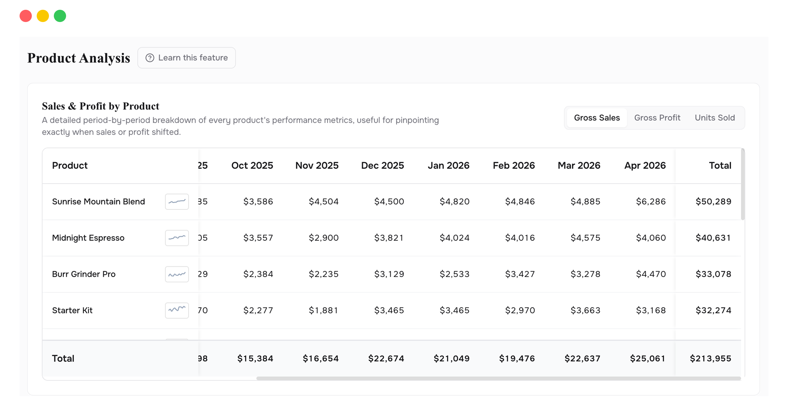
PRODUCT ANALYSIS
Gross revenue and gross profit trends for every product, variant, and collection. The chart shows you which products deserve attention. One click shows you why.
Revenue reports rank products by sales. But a product that sells 500 units at thin margins might contribute less profit than one that sells 50 units at healthy ones. Without seeing sales and profit together, you're making product decisions based on volume, not value.
Product Analysis opens with two charts side by side: gross sales and gross profit, both plotted over time. Your top 5 products are highlighted automatically, each in its own color, so you can see trajectories at a glance. A product with rising sales but flat profit stands out immediately.
Click any product in the chart and a detailed breakdown opens below, showing every cost layer for that product in that period: COGS, shipping, discounts, refunds, and fees. You can switch between product, variant, and collection views. Product view gives you the headline. Variant view finds the specific SKU dragging a product down. Collection view tells you whether the problem is isolated or shared across a category.
Revenue and margin trends plotted together. Divergence between the two is the signal to investigate.
Your biggest products are pre-selected in the chart. See them immediately, or switch to custom selection.
Three levels of detail. Start broad, drill in, or step back to category-level trends.
Click any product and see the full cost waterfall for that item in that period. COGS, shipping, discounts, refunds, all allocated.
Pick specific products to compare on the chart. Side-by-side performance of any combination you choose.
Daily, weekly, monthly, quarterly, or yearly views. Check whether underperformance is structural or a one-time blip.
The chart gives you a fast read on every product at once. Sales and profit, side by side, across time. When something looks off, click into it. The full breakdown opens below, showing every cost layer for that product in that period. You go from a high-level view of everything to a detailed view of one product in one click. That speed is the point.
High sales combined with low profit stands out visually on the chart. You don't need to run a report. You can see it.
Switch to variant view. The problem is rarely the entire product. It's usually one size or configuration pulling the average margin down. Fix that variant and the product-level numbers recover.
Switch from monthly to quarterly or yearly view. If a product's margin has been declining for 12 months, that's a cost problem. If it dipped once, it's probably a one-time event. The answer changes what you do about it.
Use custom selection to put two or three products on the same chart. Which one has stronger profit trajectory? Which one is growing revenue but losing margin? The comparison makes the decision obvious.
Once COGS, shipping, fees, discounts, and refunds are factored in, real profit is significantly lower than headline revenue. That's the insight, not a bug.
Product view groups all sizes, colors, and configurations together. Variant view splits them apart so you can see which individual SKU inside a product line is responsible for the margin drag.
Yes. Switch from "Top 5" to "Custom" and select as many products as you want. The chart assigns each one a distinct color.
Connect your Shopify store in 2 minutes. Your P&L, LTV, unit economics, and forecasts are ready the same day. No credit card required to start.